

CLIENT
BRAND DEVELOPMENT
Seed Phytonutrients
A new system of sustainable aluminum packaging for the organic beauty brand’s line of bath and body products
THE BRIEF
Our partnership with Seed Phytonutrients began back in 2017, when they came to us with only a logo and a vision for a beauty brand that centered around organically farmed, natural ingredients. We developed the brand from there, creating everything from their original packaging, social media content, retail displays, and more.
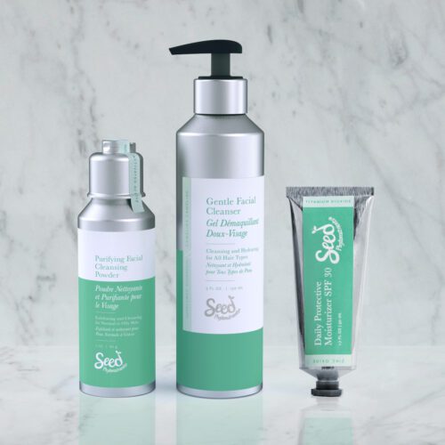
Seed wanted to evolve the brand to a cleaner, upscale look and feel. To accomplish this, we completely redesigned the product packaging system, changing from cardboard to recyclable aluminum bottles with updated labels and colors.
CHALLENGES
It was important to Seed that the new packaging remained true to their mission of sustainability, maturing the look without sacrificing the environmentally friendly quality of the existing cardboard bottles. Our new system would also need to be adaptable to a range of packtypes and products.
SOLUTION
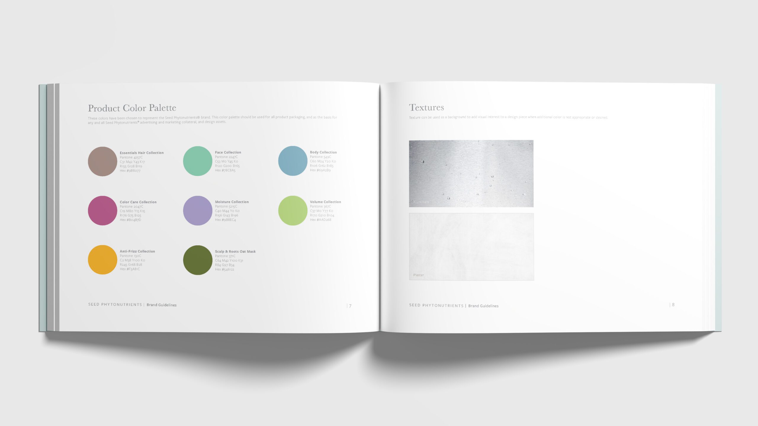
The new aluminum packaging shifted Seed’s look from homegrown organic brand to change maker in the beauty industry, while still being recyclable. As part of the packaging update, we also built a new brand guide for Seed. The color system was updated to designate eight product collections, and the labels were redesigned with a refined layout and font palette. We also created product photography for Seed’s marketing and social media.
SERVICES
- Packaging Design
- Brand Strategy
- Brand Guidelines
- Product Photography
- Illustration
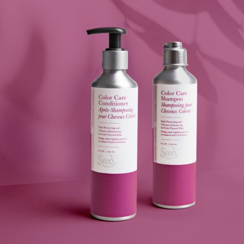
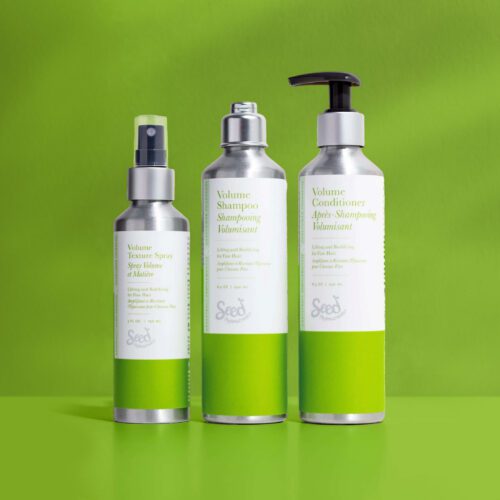
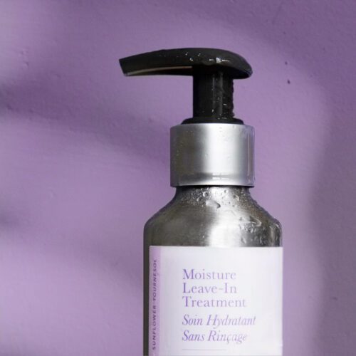
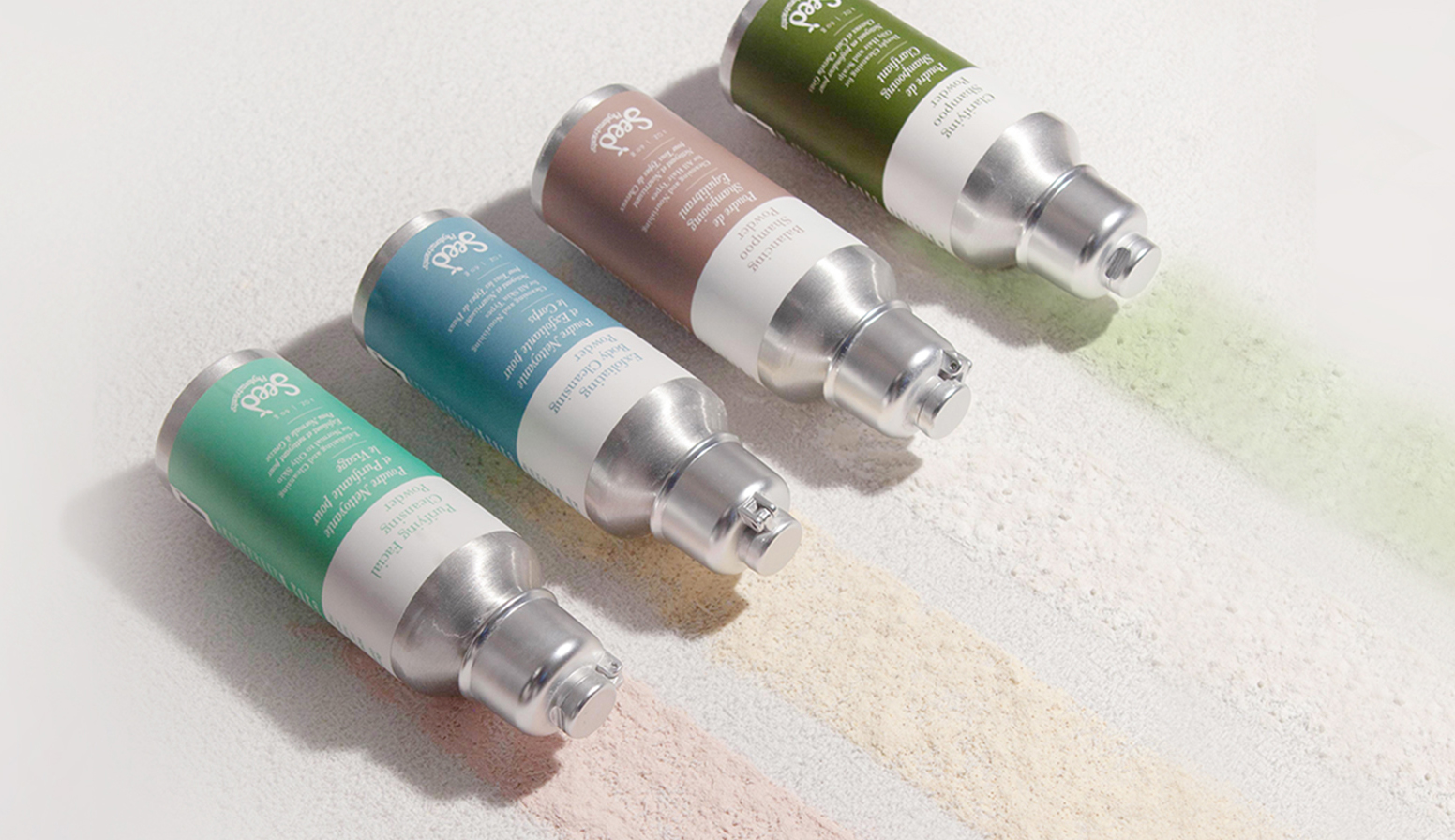
Colorful product categories
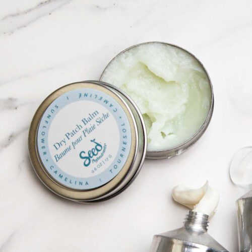
In the new Seed brand guide, we outlined a system of color coding for the brand’s eight product collections. The vibrant colors helped unite multiple packtypes such as bottles, tins, tubes, and candles into clearly defined categories, creating a color blocking effect on shelf and boosting brand recognition.

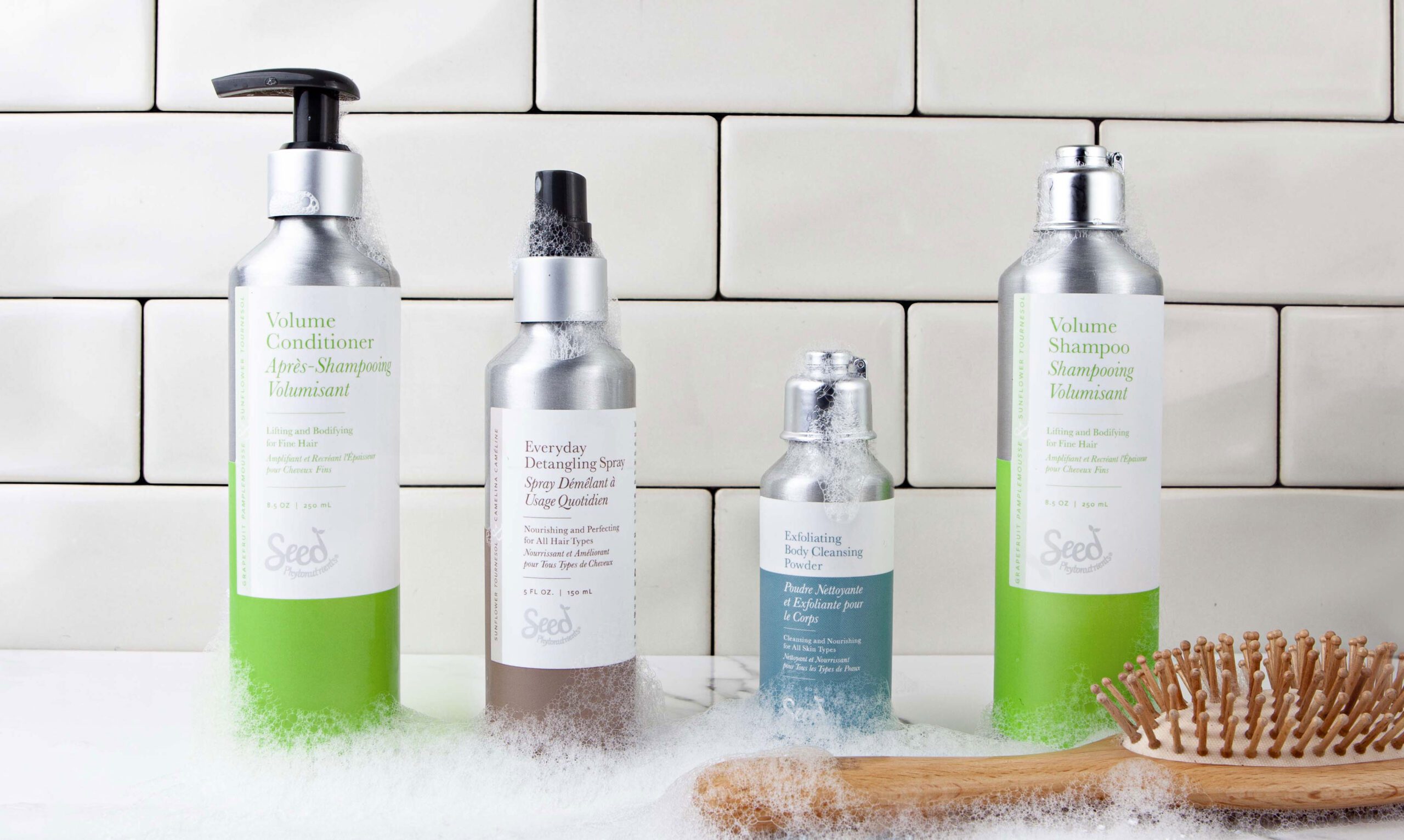
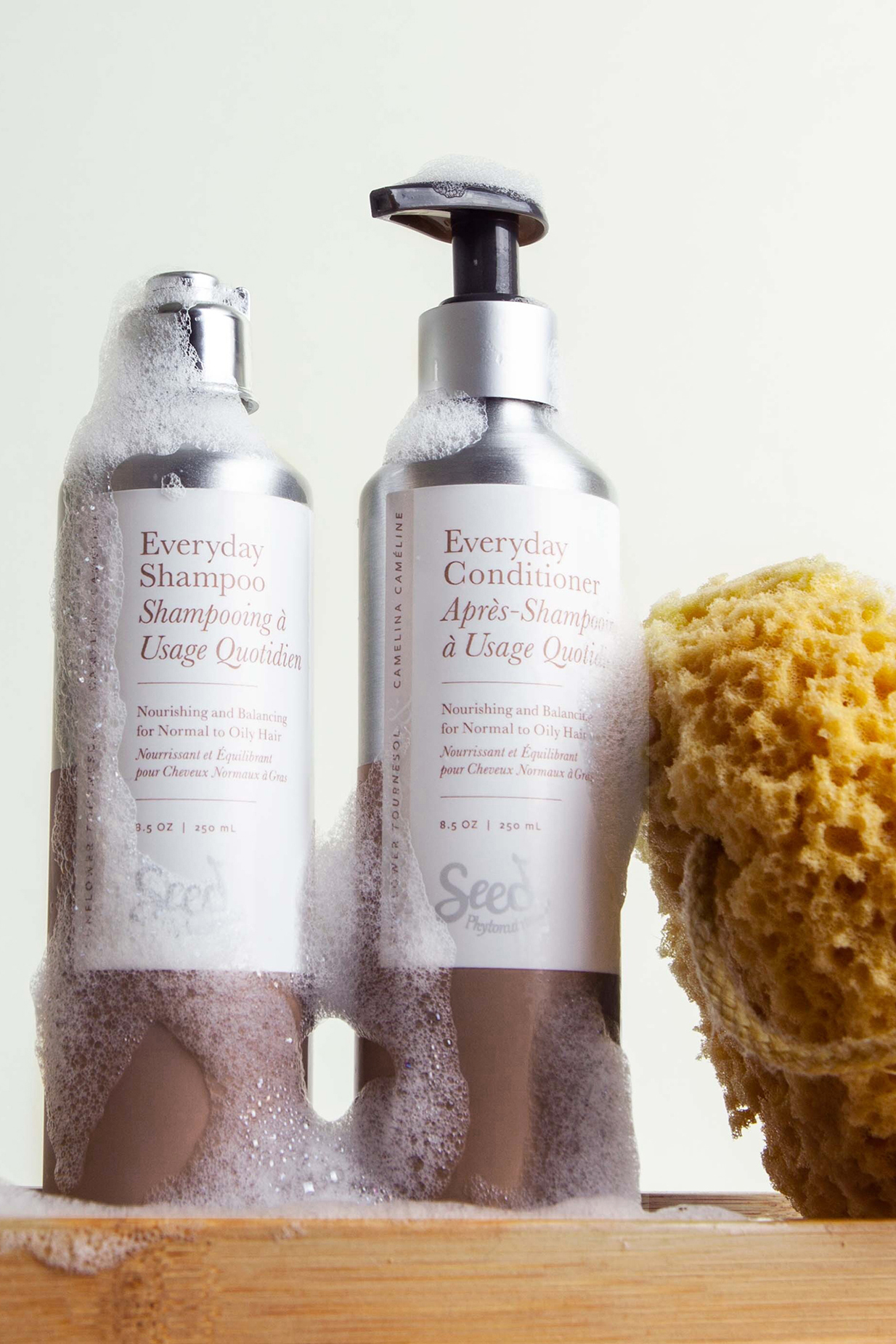
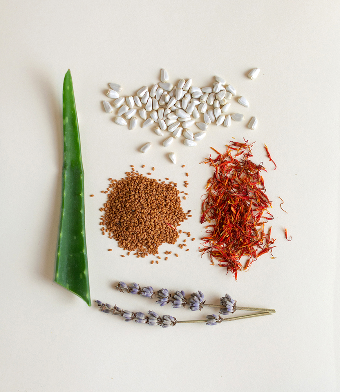
Product Photography and Rendering
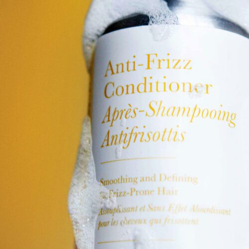
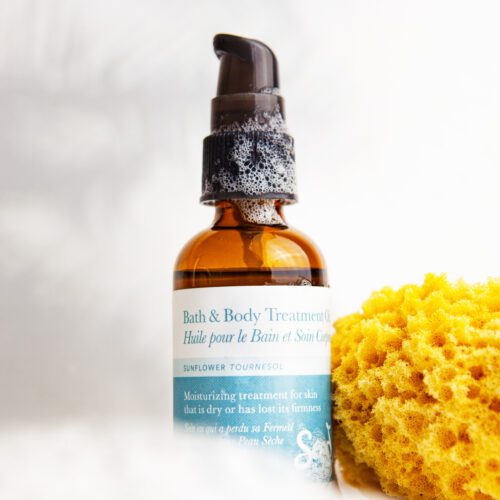
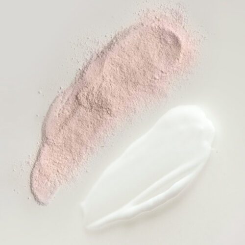
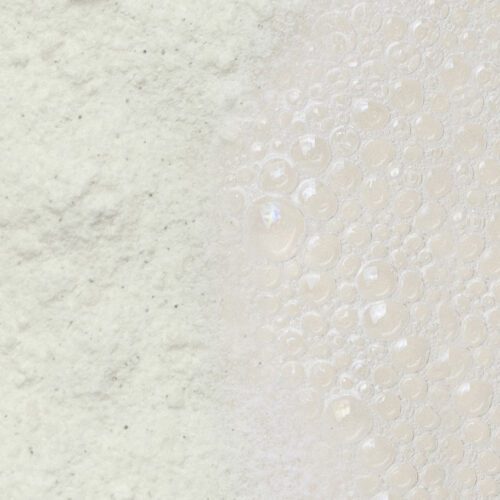
To support the rollout of the new packaging, we developed renderings prior to physical samples being available so that the Seed team could start marketing early. Once product was acquired we shot photography for ecommerce and social media. The imagery features raw ingredients and detailed product textures to highlight the natural formulation of the products and help online customers better understand the product experience.
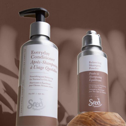

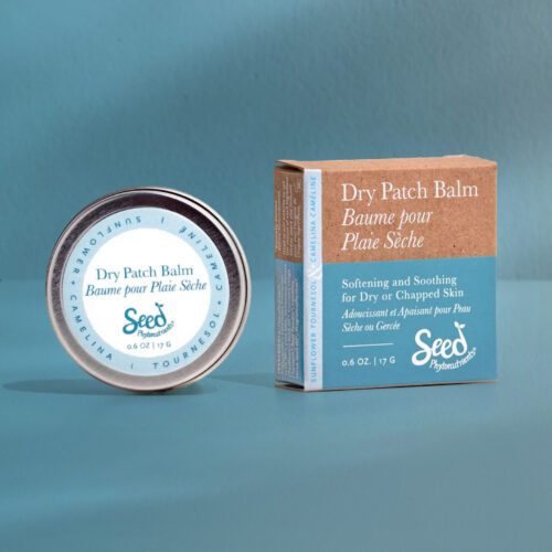
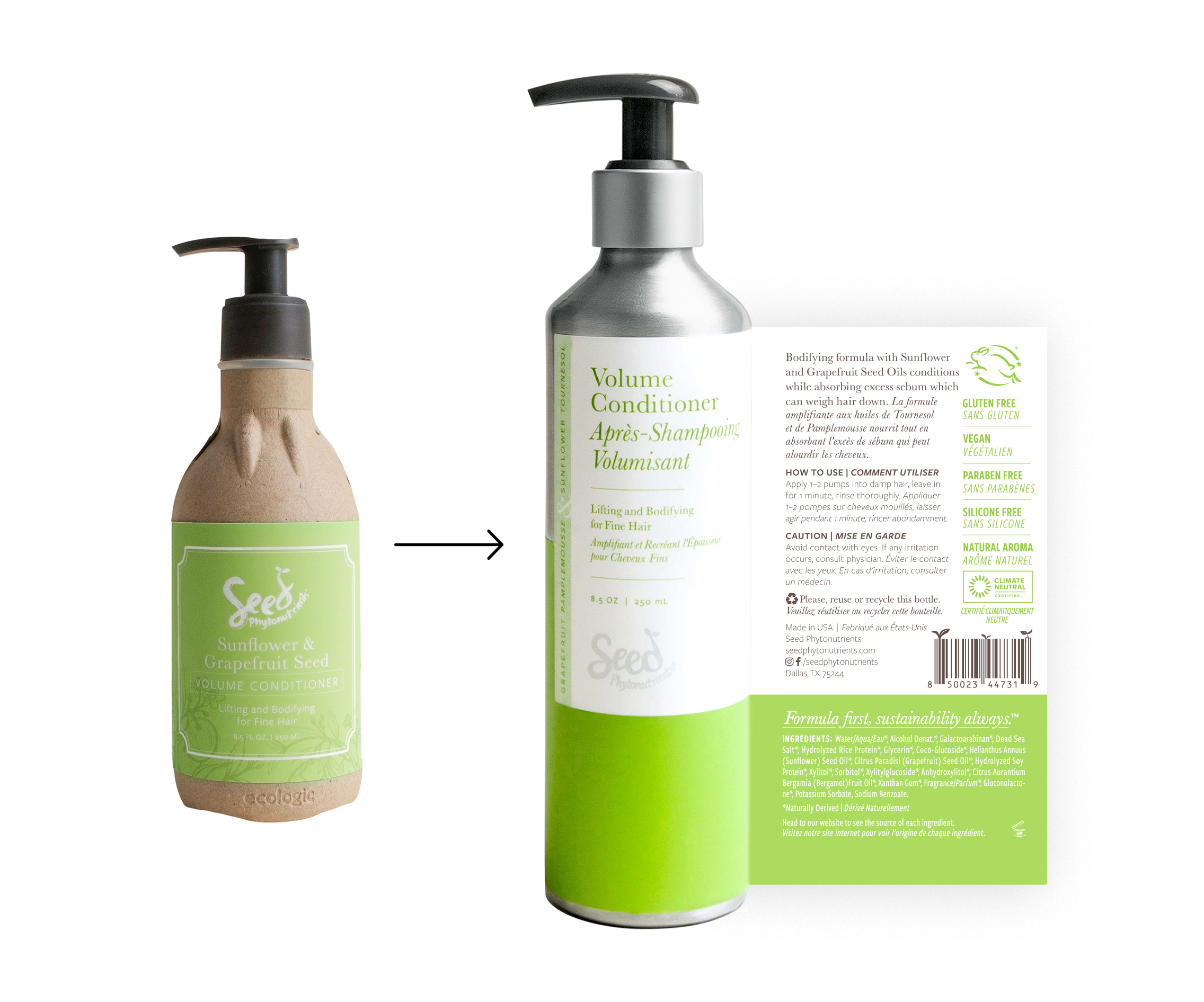
Packaging evolution
The original packaging system was built around cardboard bottles, with label designs that evoked a more natural, organic feel. The new designs are in line with the brand’s current vision, still incorporating vibrant, natural-inspired color but with a cleaner, more sophisticated look and feel.