

CLIENT
BRAND DEVELOPMENT
Kokopelli
The brand loved by adrenaline junkies repositions to reach a wider audience
THE BRIEF
Kokopelli was an established brand with a hardcore following in the packrafting space. They wanted to realign their visual identity and messaging to reach more consumers within the outdoors market.
CHALLENGES
The new identity needed to mesh with the existing logo, evolving the brand rather than completely overhauling it.
SOLUTION
We chose a new color palette for the brand, dialing back the bright colors of the existing brand in favor of earth tones for a less extreme look. We then developed patterns, iconography, and document templates, giving Kokopelli the tools they needed to implement the brand across all touchpoints.
SERVICES
- Brand Identity
- Brand Guidelines
- Brand Voice and Communication Style
- Graphic Design
- Strategy


Iconography
We created multiple icons sets for different applications, including product categories, features and benefits, and recommended adventure levels. The icons were optimized for use on packaging and web.
Patterns
We created a set of brand patterns, aiming for a balance of outdoors and technical cues. Pattern designs included a geometric repeating logo pattern, an outdoors-friendly topo, and an organic wavy pattern inspired by choppy water.
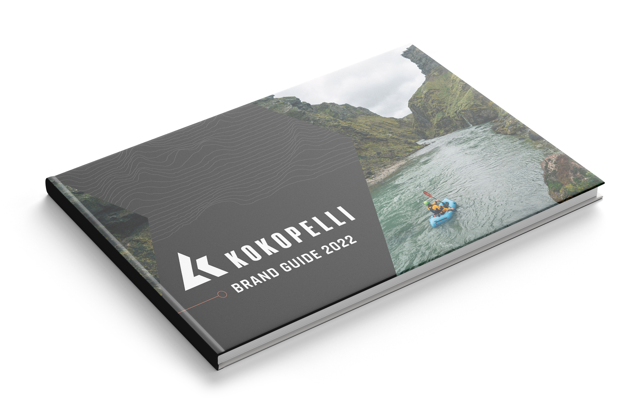
Brand Guidelines
After researching and developing the graphics, color palette, typography, and messaging, all the new assets and guidelines were compiled into a brand guide document. The 45-page book contains all the tools Kokopelli needs to begin implementing the refreshed brand across all channels and touchpoints. Intended as a living document, the guide will continue to evolve and update alongside the brand in the future.