Project: Rhino Frame
Corvus Cycles
Rhino Frame
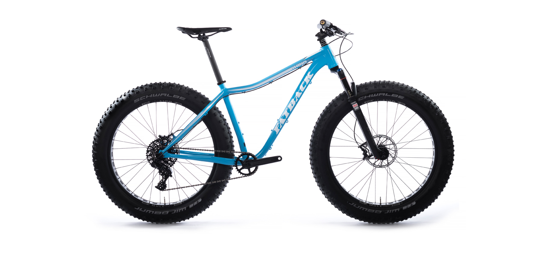
With a new alloy frame in development, Corvus enlisted the help of our creative team once again. The new frame was still nameless, so our first step was to develop a new identity for the bike. To do that, we would have to get to know this new frame a little bit better – the inspiration behind it, the features, and how it would ultimately ride.
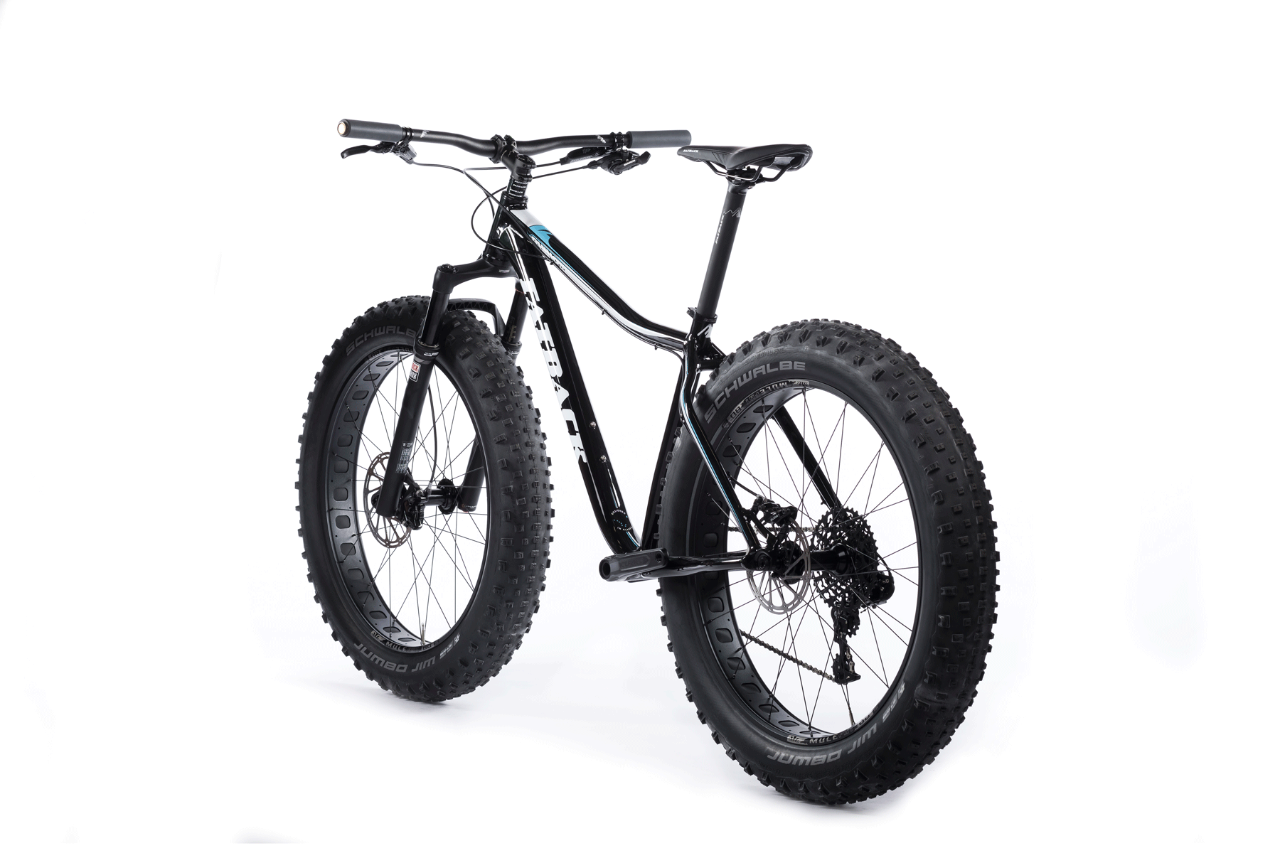
With strong, terrain conquering characteristics, we settled on the name Rhino. We created an identity for it that worked within their overall brand identity system, and played well with the other personalities in their current line of fat bikes.
Our next step was to develop a series of color ways for the Rhino bike frame. Our team pulled together a series of images and inspiration that would best represent our options for color. Once we had approval on the color ways, we began sketching out our ideas for the graphics and brand placement onto the frame. Next, we applied the final artwork onto the frame. We developed 3D renderings of the new frame that included the color ways, graphics, product identity, and logos. The final step was to develop all of the documentation, prepare the graphic files, and spec all paint colors and finish details for production.


