Project: Transition Bikes Headquarters
Transition Bikes
Transition Bikes Headquarters
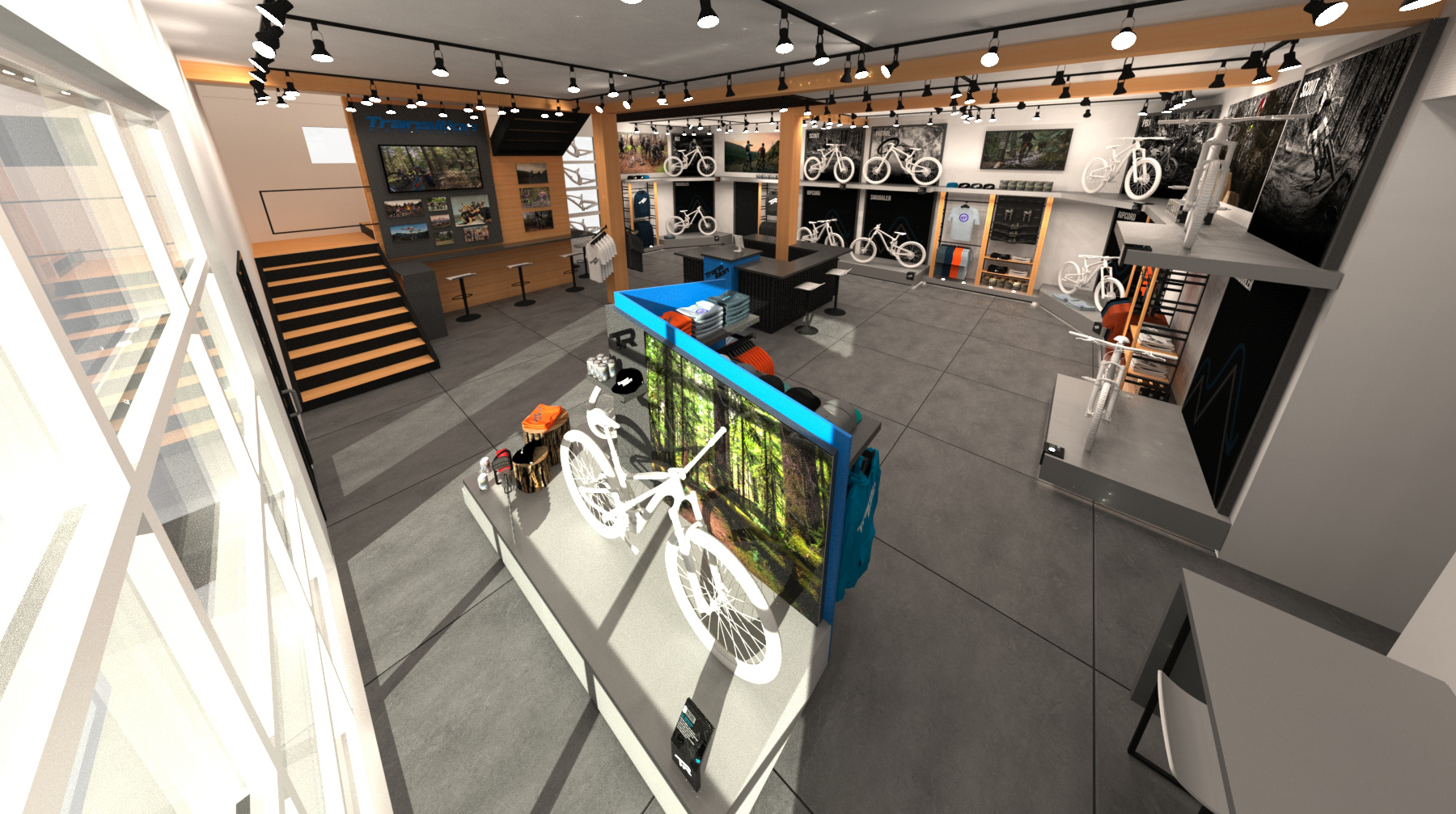
When Transition opened their new headquarters in Bellingham, they wanted to carve out a little extra space to build out a branded showroom. At just over 1400 sq. feet the small space would not only need to show off all of their latest models of bikes, but also serve as a retail store. Our design team spent some time on-site to get a feel for the space. Taking cues from the exterior features, natural lighting, reclaimed beams, and high ceilings would be key for us to create a compelling in-store experience.
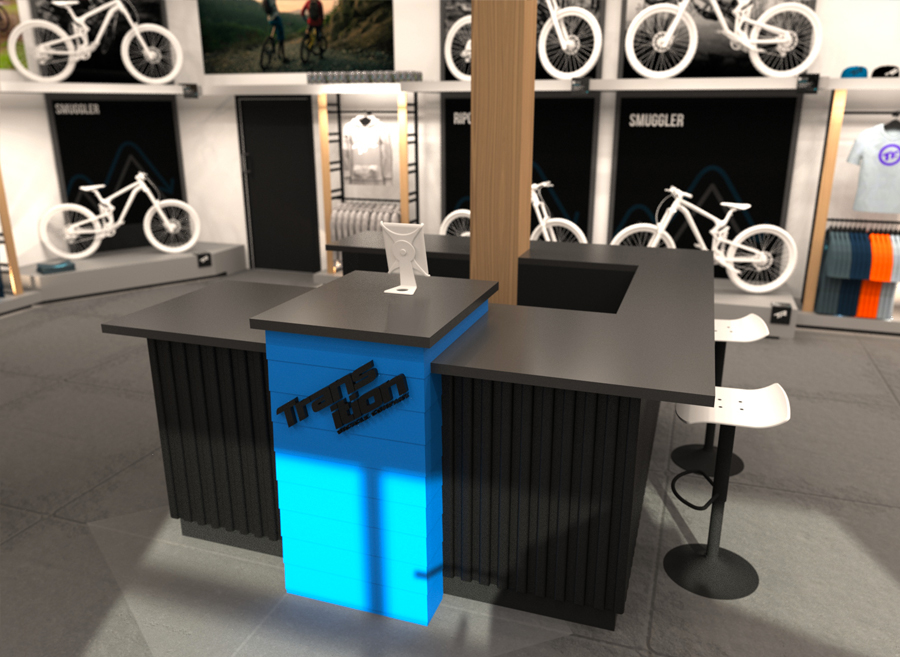
We utilized the wall space by designing an upper and lower platform that would run along the perimeter. Our goal was to provide a museum-like experience with the bike displays. We achieved this by using integrated uplighting, large format graphics, and raised information placards. We designed steel ladder displays trimmed with reclaimed wood which created visual breaks between the bike displays, and present opportunities for shopping.
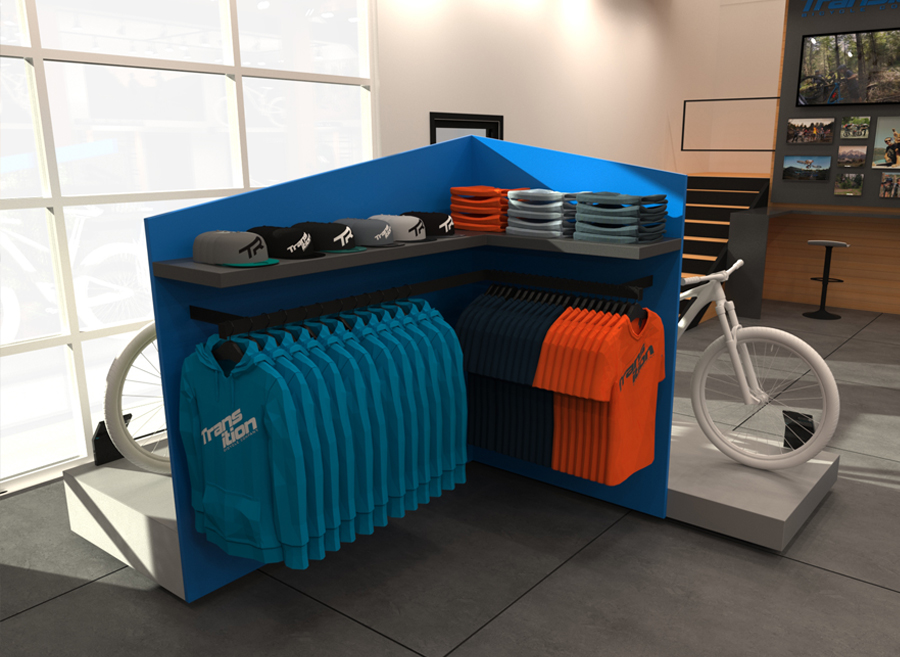
The glass roll-top garage door at the front allowed us to do something special with the entrance way. We designed a two-tiered bike display platform on casters. Low wall panels were added to create a back drop for the bikes without blocking sight lines, and created a corner on the back of the display for further merchandising.
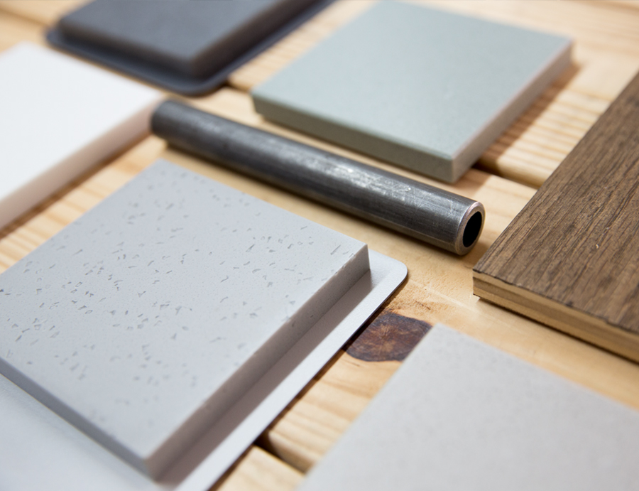
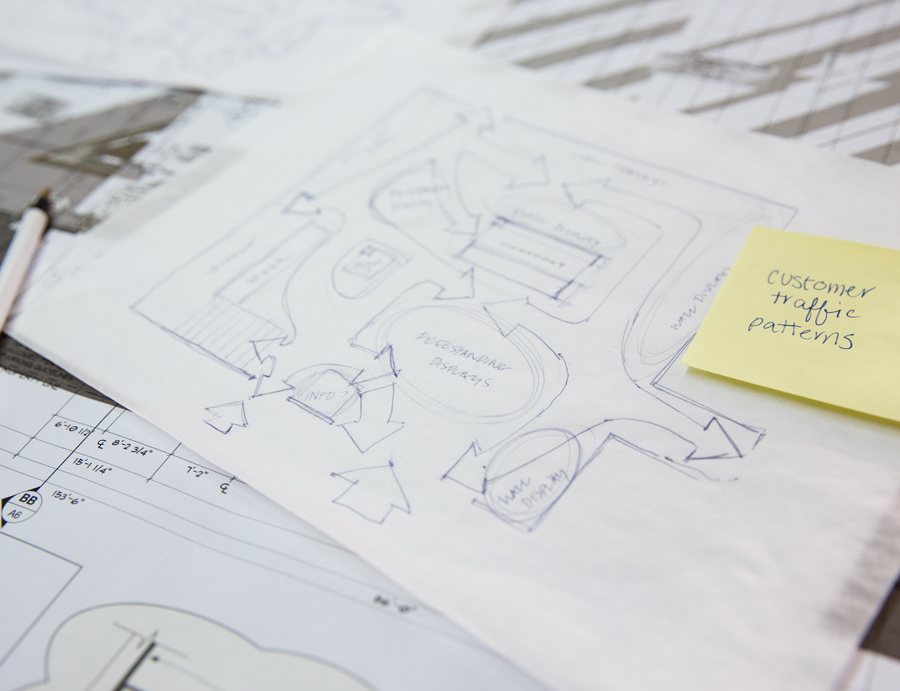
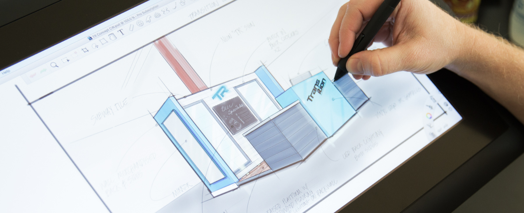
Working directly with Transition’s owners, our team was responsible for the space plan, concept design, material selection, CAD modeling, renderings, and drawings for fabrication.
